You are using an out of date browser. It may not display this or other websites correctly.
You should upgrade or use an alternative browser.
You should upgrade or use an alternative browser.
Suggest BEST LOGO for SIASAT.PK from proposed LOGOS .... POLL
- Thread starter aasimnaveed
- Start date
aasimnaveed
MPA (400+ posts)
@aasimnaveed
Can you please tell me what is the message in number 11? or what is the concept behind it?
adeeel bhai its just S from siasat and stars from pakistani flag ... but if i put pakistani flag within logo then its not worth it i think so .... because this site is not only for pakistani siasat so why put pakistani flag .. lighter touch is already there, my first thinking was about pakistani flag and map but my cousin told me that its not only for pakistani politics ,its about international politics and other topics aswell so how your theme would be pakistani flag or map ... what you say @Adeel and @Raaz etc...
second thing brother i used only photoshop on my macbook laptop ,without mouse and without any vector graphics software like illustrator or corel draw which are in my opinion best for logo creation, playing with text and pictures ...photoshop is for final touching and i have done everything in photoshop because corel stopped developing software for Apple ,i dont know the reason, anyway ill try for some more logos but after 21st december ... if you guys can wait ill design some with urdu fonts and some with your suggestions ...anyway thanks for appreciating
and giving me this opportunity ... thanks admin and everybody ...
Last edited:
aasimnaveed
MPA (400+ posts)
The tower of Pakistan with a rising star in background would be good as a logo for siasat.pk
brother tower of pakistan means MINAR_E_PAKISTAN ??? ... I tried but when its in its original size like smaller than what you guys watching here then difficult to understand whats that and second thing KUCH LOG KAHEIN GEY PUNJAB KA NISHAN KEUN DAALA ... THATS why i select pakistani flag ...
Agree with you
brother tower of pakistan means MINAR_E_PAKISTAN ??? ... I tried but when its in its original size like smaller than what you guys watching here then difficult to understand whats that and second thing KUCH LOG KAHEIN GEY PUNJAB KA NISHAN KEUN DAALA ... THATS why i select pakistani flag ...
PTIGermany
Politcal Worker (100+ posts)
i lik 1 and 18
mmuneeb194
Citizen
Ali-NZ
Minister (2k+ posts)
Correction dear there five provinces, 5th one is Gilgit BiltistanEleven is the best, but there should be only 4 stars below the "S". (because pakistan has 4 provinces)
oh sorry bro... thx for the correction :p
Correction dear there five provinces, 5th one is Gilgit Biltistan
aasimnaveed
MPA (400+ posts)
حقیقت میں کوئی اچھا نہیں
آپ تھوڑی اور محنت کریں
جلد بازی کی ضرورت نہیں
[MENTION=4936]Adeel[/MENTION] , [MENTION=4887]Admin[/MENTION]
please change heading of thread and rename it as
" these are some examples from aasimnaveed ,if you think you can make better than these, then go ahead and show your expertise" :)


mmuneeb194
Citizen

Pak Falcon
Minister (2k+ posts)
12 is the most professional
QaiserMirza
Chief Minister (5k+ posts)
اگر ہماری قومی زبان کے کچھ الفاظ بھی اس لوگو میں شامل ہوتے تو بہتر لگتا
aasimnaveed
MPA (400+ posts)
inshallah ill try to design some new ones with urdu fonts n with diff styles... thnx for appriciation
-
-
-
-
-
-
-
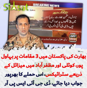
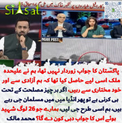
بھارت کے پاکستان پر میزائل حملے
80 | FORUM -
-

-
-
-
-
-


© Copyrights 2008 - 2025 Siasat.pk - All Rights Reserved. Privacy Policy | Disclaimer|
Official Siasat.pk Social Media Accounts


